
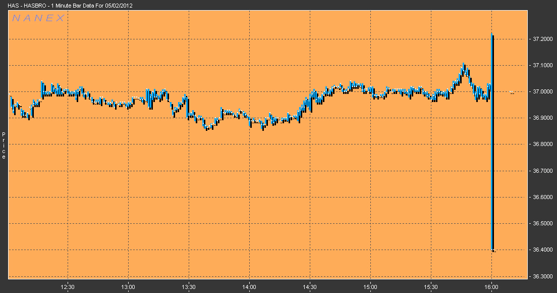
Nanex ~ 02-May-2012 ~ Volatility on DemandEither someone likes buying high and selling low, or they have figured out how to significantly increase the volatility in a stock.On May 2, 2012 beginning right at market close (16:00 Eastern) and continuing for about 54 seconds, an HFT algo ran that significantly increased volatility and impacted at least 34 stocks. We think this was either a test of an algorithm someone is getting ready to deploy during market hours, or that this algo already runs during market hours, but is much harder to detect amidst the huge volume of market data noise. Since the Flash Crash, using real actual market data, we have debunked, several, claims made by HFT proponents. One claim that we haven't been able to debunk up until now, was that HFT dampens volatility. We believe that beneficial HFT acting as a market maker will dampen volatility. But there is only room for one or two market making HFTs in a stock, so newcomers have to find other ways of squeezing out profits from each equity transaction. Here's one such algo we uncovered that appears to be geared for creating volatility on demand (if someone designed this algo to make money from buying low and selling high - they failed miserably). Since we have seen this same algo pattern in the past, it is not likely to be from poor programming. See also Latency on Demand. |
| The first 3 images are 1 minute OHLC bar charts that show just how damaging this algo was to price discovery. We only show 3 of the 34 stocks we found, but they all show a similar pattern. |


|
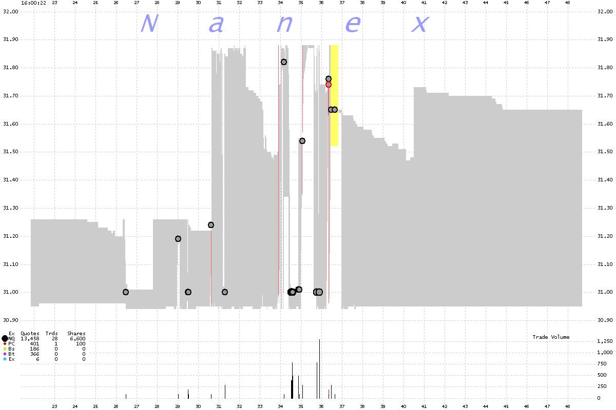
The next set of images detail one of the stocks affected, Potlatch Corporation (PCH) which has a market cap of $1.25 billion. Trades are circles while best bids and offers are triangles: each color coded by exchange. NBBO is shaded black if the best bid < best ask, yellow if best bid = best ask, or red if best bid > best ask.
Note how the best bid price drives higher within just milliseconds until it exceeds the best ask price and trades execute. Then the best bid price will drop back near where it started, and the best ask price will drive lower over the next few milliseconds until it drops below the best bid price and trades execute. |
|
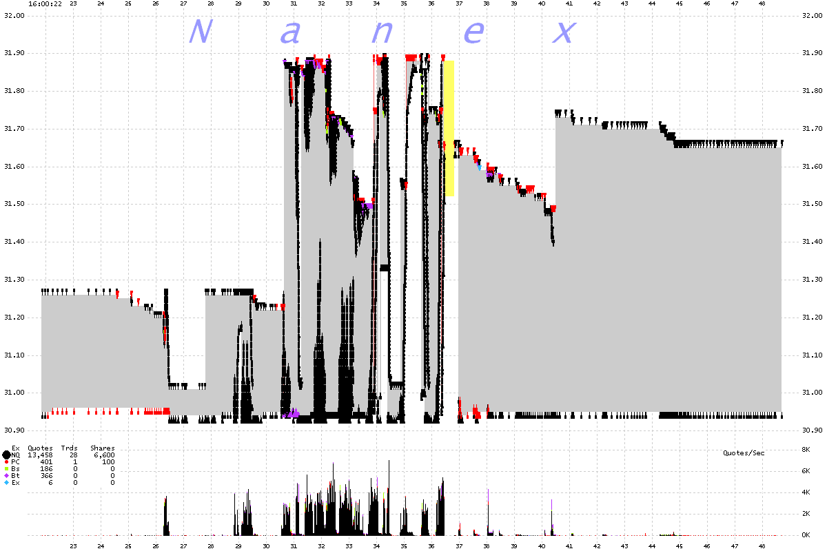
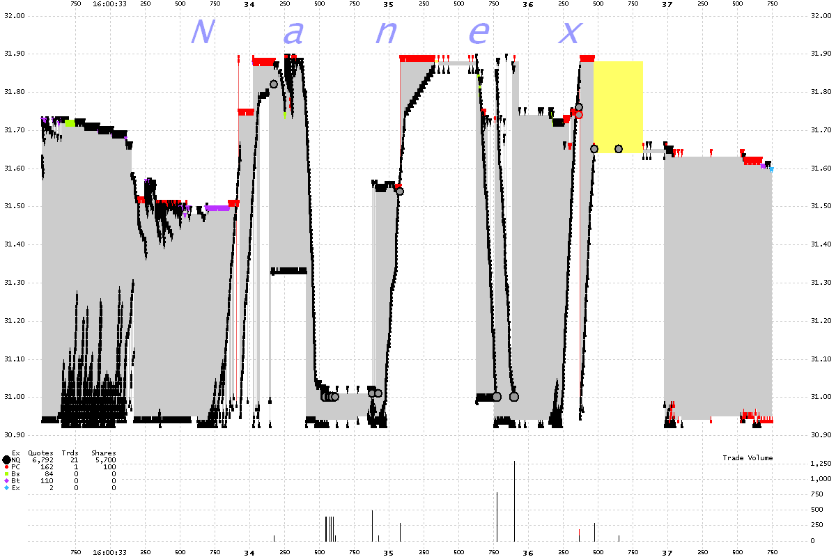
The next set of images are tick charts (how to read) showing trades (large gray circles), the best bid (green dots) and the best ask (red dots). The colored lines are bids and asks from other exchanges which you can pretty much ignore. Note how the best bid price (green dots) drives higher within just milliseconds until it exceeds the best ask price (red dots) and trades execute (gray dots). Then the best bid price will drop back near where it started, and the best ask price will drive lower over the next few milliseconds until it drops below the best bid price and trades execute. This pattern repeats more or less many times in each stock. |